CLYDE – Council unanimously agreed to send its logo in its rebranding initiative back to the drawing board for one final tweak.
The marketing and branding logo was expected to get final approval at the Village of Clyde’s regular council meeting on Oct. 21. Instead, councillors asked for changes to its font. The logo had combined two separate fonts but the majority of council wanted it to be one font.
Councillors Danielle Dillman and Alex Strembesky, as well as deputy mayor Alma Cruise Irwin, all agreed that combining two different fonts made the logo look inconsistent.
“It should be the same font,” said Cruise Irwin.
Strembesky said he liked the two fonts and had no preference of which one is used, adding “as long as it’s consistent.”
Coun. Donna Moore wasn’t present.
Mayor Charis Aguirre was the only one who liked the use of two different fonts.
“I personally like it, but I’m outnumbered,” she said.
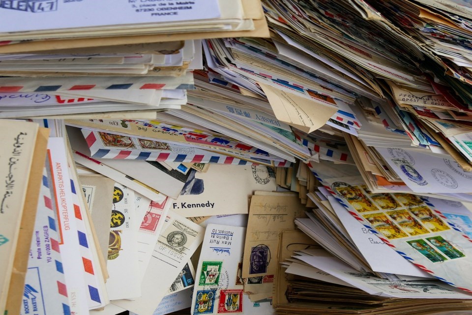
The village is rebranding around a stamp and post office theme after marketing strategist Corey Brewis, from Fort Saskatchewan-based marketing company unfussy, had suggested to council that they capitalize on the fact that Clyde was named in honour of its first postmaster, George D. Clyde.
The rebranding is part of Clyde’s strategic plan. Part of the plan’s vision is to create economic growth and inspire a high quality of living in the community for future generations. To reach this goal, they are developing a marketing strategy for both residential opportunities and new business development.