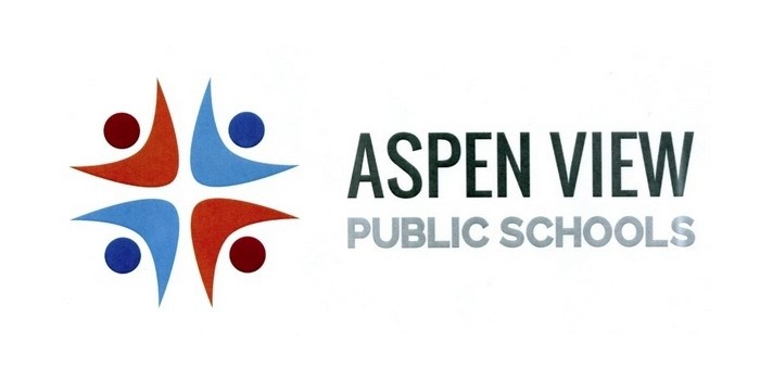
An updated, more modern logo concept has been adopted by the Aspen View Public Schools (AVPS) board of trustees.
The concept (at right) shows four stylized people which, according to AVPS communications officer Richard Cloutier, represent community and family. And while some trustees liked the entire logo, there were a couple that would like a softer and more appealing font. The colour scheme will also get a second look, since it was noticed by trustee Lewis Semashkewich that the suggested ones are not those used in the division and are associated with at least one school that borders the region to the south.
Cloutier did explain the blue/orange scheme are “complimentary colours” and it was done this way to keep things simple. However, one version shown with each ‘person’ a different colour elicited a favourable response from trustees, who felt it meant inclusion, acceptance and diversity.
The new logo is part of the division’s overhaul of their website, since the previous logo was extremely hard to reproduce digitally.
Superintendent Mark Francis explained the old logo served the division well, but a “re-branding” could be easily completed especially with work on a new and better website being done at the same time.
Two other logos were presented – one that had the letters A and V combined and the other with a modernized leaf and a blue stream below it. The first was rejected as “too Star Trek like” by administration, while the other was deemed by trustees as nice and representative of the region, but not of the students and the community.
While the concept of the logo has been approved, the final recommendation that will include colour and a different looking font is slated to be presented to the board at their meeting Thursday.